Many people outside North Carolina may not know about a particular promotion Bojangle's, the chicken and biscuits fast food chain, does for UNC basketball fans, but I think it's rather brilliant.
The set up is, if UNC scores 100 or more points against an opponent during a game, Chapel Hill area Bojangle's offer 2 sausage biscuits for a dollar the next morning.
At the end of last nights game, UNC was crushing Marshall. With a few minutes left, UNC was within a few shots of the 100 mark. Many fans were on the edge of their seats, in hopes of getting those 50 cent biscuits in the morning. The hopes for biscuits made things exciting during what would have otherwise been an unexciting conclusion to the game.
The marketing scheme is a win-win. It works for both UNC basketball and for Bojangles because fans stick around for the end of a game when they otherwise wouldn't and also get excited about Bojangle's product. The promotion has been going on for several years, so even casual UNC fans know to cheer the team on when they're approaching 100 points. I think Bojangle's sponsorship/promotional dollars are being well-spent on this approach to marketing. The 'Biscuits' promo seems to be much more worth the money than any court-side banner or marquee elsewhere in the arena.
For businesses to make such a promotion work there has to be the right combination of loyal fans, a strong athletic program, and a suitable product. I think Bojangles and UNC have figured out the formula.

Showing posts with label marketing. Show all posts
Showing posts with label marketing. Show all posts
Wednesday, December 23, 2009


Wednesday, December 2, 2009
AT&T Challenges Verizon
We've all seen cell phone commercials. There's a multitude of them and it seems that each company has it's own gimmick, theme, or celebrity. Recently I have noticed a couple TV ads that stand out. They're from AT&T and feature actor, Luke Wilson.
I noticed the ads because they are fighting back Verizon's recent claims. Verizon puts great deal of emphasis on their "4G" coverage, and how they out-do AT&T. I noticed (before the new AT&T commercials came out) that when Verizon shows a comparison between the map of their coverage and that of their competitors, they only show 4G. They never compare the total coverage area. In other words, it seems to me that Verizon may have a greater number of super awesome spots, but they have a lot more spots that have mediocre or poor coverage than they're competitors. AT&T has taken to pointing this fact out to the rest of the world.
There are several commercials in the series, but my favorite is the "Postcard" one, which shows Luke Wilson tossing postcards that represent all of the places that AT&T has coverage. I like the ad because the commercial specifically addresses Verizon's claims, it's not an overly complicated concept, it gets its point across visually and it does something clever that I've never seen any other commercial do.
It has a part one and a part two. When you see the commercial, after 30 seconds, it moves on to the next product's advertisement. Then, before you've returned to the program you tuned in to watch, you see Luke Wilson again for a few seconds, continuing to toss out postcards. Brilliant! It reminds the customer about the product without bombarding them. It's pleasantly unexpected and not annoying. It turns 60 seconds of advertising $ into a couple minutes because during those other commercials in between you assume Luke has been tossing postcards the whole time. I think the whole thing was not only clever, but results-oriented. (Too many commercials are neither, but that's another soap box.)
I thought the commercial was great, as well as the other one's in AT&T's recent line up.
What do you think? See for yourself.
I noticed the ads because they are fighting back Verizon's recent claims. Verizon puts great deal of emphasis on their "4G" coverage, and how they out-do AT&T. I noticed (before the new AT&T commercials came out) that when Verizon shows a comparison between the map of their coverage and that of their competitors, they only show 4G. They never compare the total coverage area. In other words, it seems to me that Verizon may have a greater number of super awesome spots, but they have a lot more spots that have mediocre or poor coverage than they're competitors. AT&T has taken to pointing this fact out to the rest of the world.
There are several commercials in the series, but my favorite is the "Postcard" one, which shows Luke Wilson tossing postcards that represent all of the places that AT&T has coverage. I like the ad because the commercial specifically addresses Verizon's claims, it's not an overly complicated concept, it gets its point across visually and it does something clever that I've never seen any other commercial do.
It has a part one and a part two. When you see the commercial, after 30 seconds, it moves on to the next product's advertisement. Then, before you've returned to the program you tuned in to watch, you see Luke Wilson again for a few seconds, continuing to toss out postcards. Brilliant! It reminds the customer about the product without bombarding them. It's pleasantly unexpected and not annoying. It turns 60 seconds of advertising $ into a couple minutes because during those other commercials in between you assume Luke has been tossing postcards the whole time. I think the whole thing was not only clever, but results-oriented. (Too many commercials are neither, but that's another soap box.)
I thought the commercial was great, as well as the other one's in AT&T's recent line up.
What do you think? See for yourself.
Wednesday, October 28, 2009
Masters of Disguise: Sunsweet Ones
October is the right time of year for disguises, but did you ever think cleverly packaged prunes would be the next "super fruit?"
Though some produce companies have been able to successfully brand their fruit products, such as Chiquita, it's a difficult task to market a commodity item. It seems like a piece of fruit is a piece of fruit is a piece of fruit (as long as it's fresh).
There seems to be some more room for marketing in the processed fruit category. Smucker's Jams and Jellies are well-branded and Ocean Spray Craisins (sweetened, dried cranberries) have a made a few well known marketing efforts. The newest player in the branded fruit game seems to be "Sunsweet Ones," which are prunes that are wrapped in a pretty package and cleverly marketed.

I saw the Sunsweet commercial recently and thought it was very interesting that not once did they mention the traditional name for their product. The word "prune" is never uttered. Instead they describe all of the wonderful things "dried plums" have to offer. Notice it says "dried plums" at the top of the package. The word "prune" is at the very bottom, softened by saying they're from California (California gives them cool points right?). Prunes are the same thing to plums as raisins are to grapes, but dried grapes don't have the same marketing issues dried plums do. So what's the solution? Apparently, change the name.
I think prunes do indeed have a bad reputation. Prunes are associated with older people drinking it for it's digestive effects rather than it's delicious taste. I can understand the lack of appeal when that is the connotation. Many people hear the word "prune" and automatically think "Oh, disgusting," or at best "I wouldn't go out of my way to get one." They have a foreclosed opinion about dried plums and shut down immediately.
It is smart for Sunsweet to re-brand prunes as a healthy, sweet and simple snack and also smart for them to leave the word "prune" out of their commercials. I commend them for framing their product well, focusing on the benefits to the consumer, and taking on the challenge of the fearsome prune. I doubt they will find their way into trick-or-treat baskets, but maybe people will give Sunsweet Ones a try, not realizing they are the dreaded prune in disguise.
Though some produce companies have been able to successfully brand their fruit products, such as Chiquita, it's a difficult task to market a commodity item. It seems like a piece of fruit is a piece of fruit is a piece of fruit (as long as it's fresh).
There seems to be some more room for marketing in the processed fruit category. Smucker's Jams and Jellies are well-branded and Ocean Spray Craisins (sweetened, dried cranberries) have a made a few well known marketing efforts. The newest player in the branded fruit game seems to be "Sunsweet Ones," which are prunes that are wrapped in a pretty package and cleverly marketed.
I saw the Sunsweet commercial recently and thought it was very interesting that not once did they mention the traditional name for their product. The word "prune" is never uttered. Instead they describe all of the wonderful things "dried plums" have to offer. Notice it says "dried plums" at the top of the package. The word "prune" is at the very bottom, softened by saying they're from California (California gives them cool points right?). Prunes are the same thing to plums as raisins are to grapes, but dried grapes don't have the same marketing issues dried plums do. So what's the solution? Apparently, change the name.
I think prunes do indeed have a bad reputation. Prunes are associated with older people drinking it for it's digestive effects rather than it's delicious taste. I can understand the lack of appeal when that is the connotation. Many people hear the word "prune" and automatically think "Oh, disgusting," or at best "I wouldn't go out of my way to get one." They have a foreclosed opinion about dried plums and shut down immediately.
It is smart for Sunsweet to re-brand prunes as a healthy, sweet and simple snack and also smart for them to leave the word "prune" out of their commercials. I commend them for framing their product well, focusing on the benefits to the consumer, and taking on the challenge of the fearsome prune. I doubt they will find their way into trick-or-treat baskets, but maybe people will give Sunsweet Ones a try, not realizing they are the dreaded prune in disguise.
Saturday, October 3, 2009
It's a Soft Drink
Ever heard of the "Unique Sparkling Soft Drink" commonly known as Cheerwine? If you're not from the South East, you may not have had the pleasure of enjoying this distinctive cherry-flavored soda.

Cheerwine, produced by the Carolina Beverage Corporation, has been in existence since 1917 and has many avid fans throughout the South. In fact, some who live out of the area but grew up in the Carolinas drinking Cheerwine stock up on the soft drink while visiting home. The brand is still relatively unknown outside North Carolina, South Carolina, and Virginia, but their loyal fan base in that region makes the company unique.
The reason Cheerwine caught my attention, other than the fact that I enjoy the taste of the drink, is their website and marketing. If you check out their website, they offer information for distributors and branded t-shirts, but also offer a culture. The quirky set up of the site and the series of videos featuring the product help to position the soft drink in the minds of consumers.
Word-of-mouth is something that could really work to the advantage of such a company. In fact, I heard about the product via word-of-mouth. I don't know what the future plans for Cheerwine include, but the company should take advantage of it's loyal fans and expand distribution. Clearly a nearly 100-year old recipe has worked in the Carolinas. Maybe they can apply that to an ever-widening market.
www.itsasoftdrink.com

Cheerwine, produced by the Carolina Beverage Corporation, has been in existence since 1917 and has many avid fans throughout the South. In fact, some who live out of the area but grew up in the Carolinas drinking Cheerwine stock up on the soft drink while visiting home. The brand is still relatively unknown outside North Carolina, South Carolina, and Virginia, but their loyal fan base in that region makes the company unique.
The reason Cheerwine caught my attention, other than the fact that I enjoy the taste of the drink, is their website and marketing. If you check out their website, they offer information for distributors and branded t-shirts, but also offer a culture. The quirky set up of the site and the series of videos featuring the product help to position the soft drink in the minds of consumers.
Word-of-mouth is something that could really work to the advantage of such a company. In fact, I heard about the product via word-of-mouth. I don't know what the future plans for Cheerwine include, but the company should take advantage of it's loyal fans and expand distribution. Clearly a nearly 100-year old recipe has worked in the Carolinas. Maybe they can apply that to an ever-widening market.
www.itsasoftdrink.com
Wednesday, September 30, 2009
Keeping Tabs
I have always enjoyed the chance to sit and flip through a magazine. In fact, the content isn't the only draw. I find the ads fun to look at too because they're meant to be eye-catching and attractive.
In a recent copy of Allure Magazine, one advertising page especially caught my attention for it's creativity and interactive element. I have to give them credit for thinking outside the box. The page features pull-off stickers of the lip color products that the reader is encouraged to use as sticky-tabs to bookmark pages while perusing the magazine.

I like the idea because the stickers increase the length of the interaction between the consumer and the advertisement. It takes advantage of the qualities of having print media form, something that's in the hands of consumers.
The idea was great, but the execution needed a bit of work. The stickers weren't sticky enough to adhere well to the glossy pages and fell off easily. Maybe they should get some tips from 3M, makers of "Post-its." Also, the brand name was not a prominent feature of either the ad as a whole or the individual stickers.
So many "creative" marketing ideas focus on being "innovative," without the component of practicality and goal of reaching the hearts and minds of consumers. I give them points for having a creative ad that goes in the right direction, and has the specific intent to increase product interaction with consumers.
In a recent copy of Allure Magazine, one advertising page especially caught my attention for it's creativity and interactive element. I have to give them credit for thinking outside the box. The page features pull-off stickers of the lip color products that the reader is encouraged to use as sticky-tabs to bookmark pages while perusing the magazine.

I like the idea because the stickers increase the length of the interaction between the consumer and the advertisement. It takes advantage of the qualities of having print media form, something that's in the hands of consumers.
The idea was great, but the execution needed a bit of work. The stickers weren't sticky enough to adhere well to the glossy pages and fell off easily. Maybe they should get some tips from 3M, makers of "Post-its." Also, the brand name was not a prominent feature of either the ad as a whole or the individual stickers.
So many "creative" marketing ideas focus on being "innovative," without the component of practicality and goal of reaching the hearts and minds of consumers. I give them points for having a creative ad that goes in the right direction, and has the specific intent to increase product interaction with consumers.
Wednesday, August 26, 2009
Top of the Box
I think the "Box Tops for Education" campaign launched by General Mills in 1996 was a brilliant bit of marketing genius. The on-going Box Tops program helps to create positive brand image for participating brand name products, but also motivates buyers to chose Box Tops products over comparable non-participating brands.
What could be better than having a charity program that is tied directly to the product packaging and supporting a cause dear to the hearts of target consumers? The Box Tops products are ones that families buy, and improving schools and education is a cause that has wide appeal.

I think the Box Tops program also functions as a tool for product differentiation. Everyone has walked down the cereal isle at the grocery store. More than many other isles in the super market, it's marketing that makes one product in the cereal isle seem vastly different than the other. It's amazing we're not all overwhelmed by the bright colored boxes and seemingly endless number of choices we have. In the end, most cereals serve the same function. The taste and sugar content may vary, but they're all essentially dry chunks of processed grains. Clearly, I don't have detailed marketing research on the subject at my disposal, but I think the Box Tops may persuade a indecisive shopper to choose a General Mills box over a similar cereal. That little $.10 tag psychologically makes a difference. You think you're getting more for your money than just sugary grain puffs.
The company is required to redeem the usually 10 cent value of the labels submitted to participating schools, and while the cost of millions of Box Tops adds up, the face value of them is negligible compared to the cost of the products. The Box Tops website notes that more than $250 million-worth have been redeemed to date, but I can't even imagine the gross profit margin of the products that those tops came from. That doesn't include the value of those that went into the trash with the rest of the cardboard package. I've even collected them myself, and thrown them away simply because I didn't have a convenient place to donate them.
The Box Tops program has been expanded to include many other products and brand names outside the cereal isle, but the tops seem to serve the same function. They make that Box Tops brand a little more appealing than the one next to it on the shelf, and more likely to end up in the a basket waiting in the checkout line.
What could be better than having a charity program that is tied directly to the product packaging and supporting a cause dear to the hearts of target consumers? The Box Tops products are ones that families buy, and improving schools and education is a cause that has wide appeal.

I think the Box Tops program also functions as a tool for product differentiation. Everyone has walked down the cereal isle at the grocery store. More than many other isles in the super market, it's marketing that makes one product in the cereal isle seem vastly different than the other. It's amazing we're not all overwhelmed by the bright colored boxes and seemingly endless number of choices we have. In the end, most cereals serve the same function. The taste and sugar content may vary, but they're all essentially dry chunks of processed grains. Clearly, I don't have detailed marketing research on the subject at my disposal, but I think the Box Tops may persuade a indecisive shopper to choose a General Mills box over a similar cereal. That little $.10 tag psychologically makes a difference. You think you're getting more for your money than just sugary grain puffs.
The company is required to redeem the usually 10 cent value of the labels submitted to participating schools, and while the cost of millions of Box Tops adds up, the face value of them is negligible compared to the cost of the products. The Box Tops website notes that more than $250 million-worth have been redeemed to date, but I can't even imagine the gross profit margin of the products that those tops came from. That doesn't include the value of those that went into the trash with the rest of the cardboard package. I've even collected them myself, and thrown them away simply because I didn't have a convenient place to donate them.
The Box Tops program has been expanded to include many other products and brand names outside the cereal isle, but the tops seem to serve the same function. They make that Box Tops brand a little more appealing than the one next to it on the shelf, and more likely to end up in the a basket waiting in the checkout line.
Tuesday, July 21, 2009
NASA: Then and Now
The current media attention being given to the National Aeronautics and Space Administration, more commonly known as NASA, led me to consider how and what Americans think about space exploration.
NASA programs, and NASA in general have a fascinating brand identity because it seems to have a general appeal; people think positive thoughts about NASA. However, unlike many brands, they're not really selling a product and they're thought of differently by different generations. Also, as a government agency, their public relations and marketing is important, but not as key as it is for private industry.
I'm too young to have experienced what I consider the golden age of space exploration, the space race of the 1960's, but I still have a sense of what it meant to Americans. Still, because today's youth didn't experience the excitement of the first man on the moon as it happened, instead learning of it in history books, younger generations have a different perception of what the space programs mean. To young American's astronauts and space exploration are largely something to be taken for granted, accepted as "nifty," but not a truly thrilling subject.
Granted, NASA is far from the only brand name that suffers from a generation gap. However, it seems that for NASA, as an agency that is meant to perform a public service and also being on the cutting edge, the generation separation has more significance. How are NASA researchers, scientists, and astronauts going to continue to be innovative and continue to widen the bounds of human knowledge and experience without enthusiasm from the youth?
 I think the recent highlight of the Apollo missions, among other space exploration milestones, may pique the interest of a few. I don't think that's enough though, considering America's collective attention span. Maybe NASA needs to put a few pennies of it's budget into the marketing side and try to make space exciting again. After all, image is still important, even if you managed to put a man on the moon.
History of the NASA logo: http://www.logoblog.org/nasa-logo.php
NASA programs, and NASA in general have a fascinating brand identity because it seems to have a general appeal; people think positive thoughts about NASA. However, unlike many brands, they're not really selling a product and they're thought of differently by different generations. Also, as a government agency, their public relations and marketing is important, but not as key as it is for private industry.
I'm too young to have experienced what I consider the golden age of space exploration, the space race of the 1960's, but I still have a sense of what it meant to Americans. Still, because today's youth didn't experience the excitement of the first man on the moon as it happened, instead learning of it in history books, younger generations have a different perception of what the space programs mean. To young American's astronauts and space exploration are largely something to be taken for granted, accepted as "nifty," but not a truly thrilling subject.
Granted, NASA is far from the only brand name that suffers from a generation gap. However, it seems that for NASA, as an agency that is meant to perform a public service and also being on the cutting edge, the generation separation has more significance. How are NASA researchers, scientists, and astronauts going to continue to be innovative and continue to widen the bounds of human knowledge and experience without enthusiasm from the youth?
I think the recent highlight of the Apollo missions, among other space exploration milestones, may pique the interest of a few. I don't think that's enough though, considering America's collective attention span. Maybe NASA needs to put a few pennies of it's budget into the marketing side and try to make space exciting again. After all, image is still important, even if you managed to put a man on the moon.History of the NASA logo: http://www.logoblog.org/nasa-logo.php
Friday, June 26, 2009
Flo vs. the Gecko
I can't possibly be the only one who makes note of which commercials grate on my nerves when they appear on my tube. Everyone probably notices the annoying aspects of TV ads such as loud celebrity spokesmen, irritating jingles, or even just the amateur nature of local ads. I hope I'm not the only one, however, who takes notice of good commercials, or at least favorite ones (determining "goodness" is subjective).
Everyone remembers Mastercard's "priceless" commercials. I consider them to be among the classiest commercials: simple, classic, adaptable, and most importantly, memorable. I would imagine that few people have a bone to pick about those ad campaigns. Based on my own informal research, (discussions with family and friends) I have found that there seems to be some polarization over recent commercials created by the big insurance companies.
The insurance industry seems to be more drawn to creating series of commercials with well defined characters and themes. A few come to mind. Metlife has adopted Charles Schultz's Snoopy. Allstate has a trustworthy-looking African American actor giving their pitch. Insurance giants, Geico and Progressive have the cavemen and the gecko, and Flo. The first two of these companies may have a good product, but don't seem to attract loyalty for their ad campaigns. In contrast, Geico and Progressive have created followings for their characters. My informal research shows that those who are fans of the Geico commercials dislike the Progressive ones and vice versa. Personally, I'm in the Progressive camp.

Maybe I'll discuss each of the campaigns in more detail later. I wish I had access to metrics detailing the success of each campaign, or just to be a fly on the wall in a marketing meeting at one of the companies. For now, I just wanted to make note of the interesting trend. Maybe I'm in the correct market segment to be a Progressive fan and Geico people have different characteristics. I'm not alone, however, in being a fan of Flo. There's even a facebook group for her following, not that there isn't a facebook group for anything and everything these days.
What commercial characters do you find yourself becoming attached to, or even just simply not finding yourself annoyed by their interruption of your favorite program? I think it's worth the time to appreciate good marketing, even if it's just to keep from being frustrated by the clutter ads can create.
Progressive Commercial featuring Flo
Everyone remembers Mastercard's "priceless" commercials. I consider them to be among the classiest commercials: simple, classic, adaptable, and most importantly, memorable. I would imagine that few people have a bone to pick about those ad campaigns. Based on my own informal research, (discussions with family and friends) I have found that there seems to be some polarization over recent commercials created by the big insurance companies.
The insurance industry seems to be more drawn to creating series of commercials with well defined characters and themes. A few come to mind. Metlife has adopted Charles Schultz's Snoopy. Allstate has a trustworthy-looking African American actor giving their pitch. Insurance giants, Geico and Progressive have the cavemen and the gecko, and Flo. The first two of these companies may have a good product, but don't seem to attract loyalty for their ad campaigns. In contrast, Geico and Progressive have created followings for their characters. My informal research shows that those who are fans of the Geico commercials dislike the Progressive ones and vice versa. Personally, I'm in the Progressive camp.

Maybe I'll discuss each of the campaigns in more detail later. I wish I had access to metrics detailing the success of each campaign, or just to be a fly on the wall in a marketing meeting at one of the companies. For now, I just wanted to make note of the interesting trend. Maybe I'm in the correct market segment to be a Progressive fan and Geico people have different characteristics. I'm not alone, however, in being a fan of Flo. There's even a facebook group for her following, not that there isn't a facebook group for anything and everything these days.
What commercial characters do you find yourself becoming attached to, or even just simply not finding yourself annoyed by their interruption of your favorite program? I think it's worth the time to appreciate good marketing, even if it's just to keep from being frustrated by the clutter ads can create.
Progressive Commercial featuring Flo
Wednesday, April 8, 2009
Urban definition of marketing
As someone who has been involved in the marketing field, I find marketing-related humor particularly amusing. There’s a lot of junk on UrbanDictionary.com, but whoever posted something for “marketing” has the right idea.
If you look up “marketing” on UrbanDictionary.com this is what the first entry says:
You see a gorgeous girl at a party. You go up to her and say, "I'm fantastic in bed."
That's Direct Marketing
You're at a party with a bunch of friends and see a gorgeous girl. One of your friends goes up to her and pointing at you says, "He's fantastic in bed."
That's Advertising
You see a gorgeous girl at a party. You go up to her and get her telephone number. The next day you call and say, "Hi, I'm fantastic in bed."
That's Telemarketing
You're at a party and see a gorgeous girl. You get up and straighten your tie, you walk up to her and pour her a drink. You open the door for her, pick up her bag after she drops it, offer her a ride, and then say, "By the way, I'm fantastic in bed."
That's Public Relations
You're at a party and see a gorgeous girl. She walks up to you and says, I hear you're fantastic in bed."
That's Brand Recognition
I find it interesting that professionals consider themselves to be in one and only one of those fields (direct marketing, advertising, public relations, etc), but really all of those things are just “marketing.” They all have the same end goal: to get the girl. The whole idea is to get her in bed, it doesn’t much matter how you go about it.
Tuesday, April 7, 2009
What is your business card saying about you?
Most business cards that I’ve seen are on boring white 2” x 3.5” cardstock, have the boring company logo in the corner, and black text listing the name, title, and phone number of the card’s owner. They all look the same. I have a collection of my own and they all fit this description. I suppose for most of us, a stack of plain white business cards is all we can afford or all that our employers are willing to provide. However, there is hope for standing out in the business card crowd.
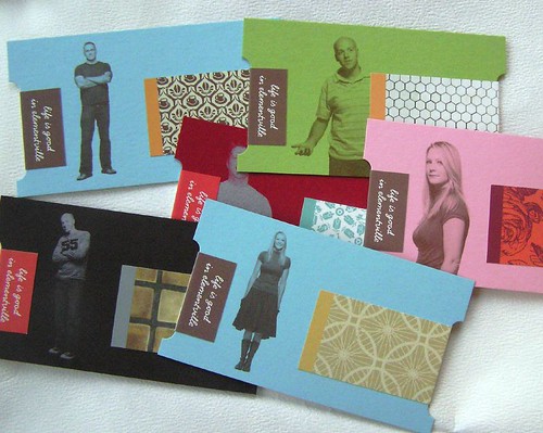
I found an interesting stack of business cards on flickr.
http://www.flickr.com/photos/dailypoetics/sets/72057594104389710/
I highly recommend sifting through them (fair warning: there’s a lot of them). Some of them include a simple gilded edge while others are different materials and shapes. Many are for design firms or for professionals involved in photography, art, or advertising, but I don’t think creativity should be limited to those fields. Everyone should have the opportunity to stand out. I can’t help but also make the point that the purpose of the card should still be paramount: to be a convenient, portable, usable source of contact information for a new acquaintance. I think some of the flickr business cards miss that mark and put form before function, a big faux-pas in my book.
These are extreme examples of creative business cards, but I plan to take some elements from what show and incorporate them into my own personal statement on 2x3.5. Rather than going with the plain black and white landscape-oriented business card, include some color or change the orientation to upright.
Even if you don’t have the luxury of changing your call-me-back card, pleased-to-meet-you, stay-in-touch card, it’s still valuable to see what others have done to think outside the business card box.
For more creative business card ideas... 10 Creative Business Card Ideas
Subscribe to:
Posts (Atom)