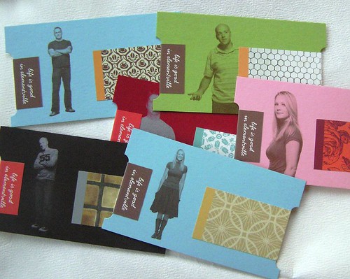
Most business cards that I’ve seen are on boring white 2” x 3.5” cardstock, have the boring company logo in the corner, and black text listing the name, title, and phone number of the card’s owner. They all look the same. I have a collection of my own and they all fit this description. I suppose for most of us, a stack of plain white business cards is all we can afford or all that our employers are willing to provide. However, there is hope for standing out in the business card crowd.
I found an interesting stack of business cards on flickr.
http://www.flickr.com/photos/dailypoetics/sets/72057594104389710/
I highly recommend sifting through them (fair warning: there’s a lot of them). Some of them include a simple gilded edge while others are different materials and shapes. Many are for design firms or for professionals involved in photography, art, or advertising, but I don’t think creativity should be limited to those fields. Everyone should have the opportunity to stand out. I can’t help but also make the point that the purpose of the card should still be paramount: to be a convenient, portable, usable source of contact information for a new acquaintance. I think some of the flickr business cards miss that mark and put form before function, a big faux-pas in my book.
These are extreme examples of creative business cards, but I plan to take some elements from what show and incorporate them into my own personal statement on 2x3.5. Rather than going with the plain black and white landscape-oriented business card, include some color or change the orientation to upright.
Even if you don’t have the luxury of changing your call-me-back card, pleased-to-meet-you, stay-in-touch card, it’s still valuable to see what others have done to think outside the business card box.
For more creative business card ideas... 10 Creative Business Card Ideas


No comments:
Post a Comment